Transforming our in-person events to online
We’ve made the very difficult decision to cancel all future O’Reilly in-person conferences. Instead, we’ll continue to invest in and grow O’Reilly online learning, supporting the 5,000 companies and 2.5 million people who count on our experts to help them stay ahead in all facets of business and technology.
Come join them and learn what they already know. Become an O’Reilly online learning member today and get innovative ways to connect with and learn from each other. Even when face-to-face gatherings are impossible.
Join us on O’Reilly online learning for 10 days. Free.
Get insight into what’s happening now. Develop skills to stay ahead of what’s next.
Try it freeTopic-focused events with no boarding pass required
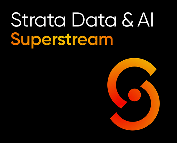
The 2020 O’Reilly Strata Data & AI Superstream online event gave more than 4,600 participants new insights and skills over two days of live sessions and interactive tutorials. It was our most attended online event ever. More like it are coming.
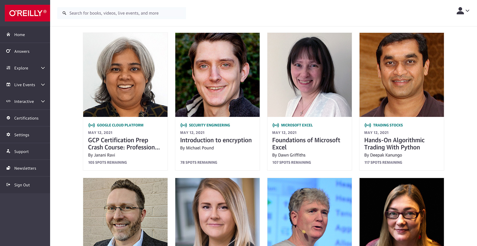
Live online training with today’s top experts
Get in the virtual classroom for live training courses on today’s hottest technologies—often by the people who had a hand in creating them. Hit them up with questions along the way. Class sizes are limited to keep the learning more personal.
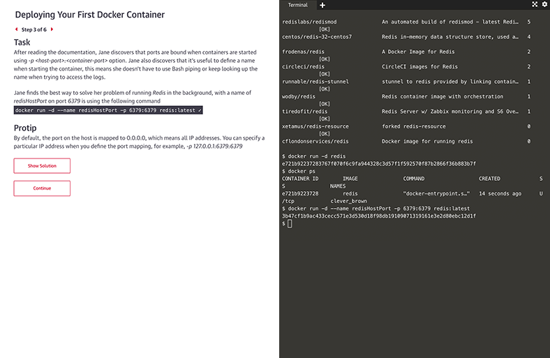
Interactive learning scenarios and sandboxes
There’s no better way to learn Kubernetes, Docker, Python, Bash, and more than just diving in and using it. Now you can, with guided interactive scenarios in a live dev environment you can access through your browser. Or get into a sandbox with a technology and write, run, or edit code to really understand how it works.
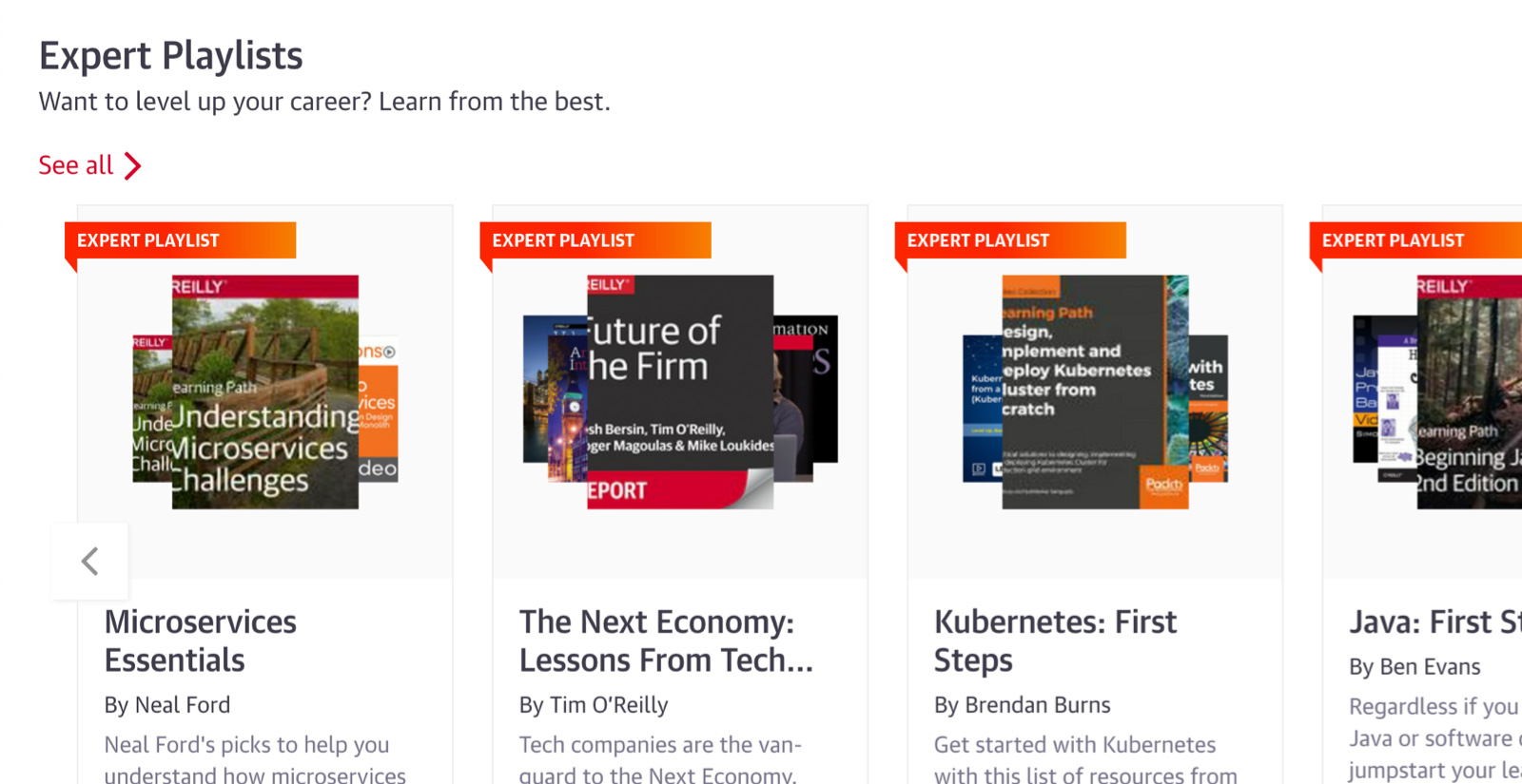
Expert playlists to guide you through nearly any topic
For over 40 years, O’Reilly experts have kept our clients ahead of the tech curve. They’ve handpicked the exact content that’s best for you to learn about nearly any technology or business approach. So you can follow along step-by-step, whether you’re just getting started or you’re already an expert.
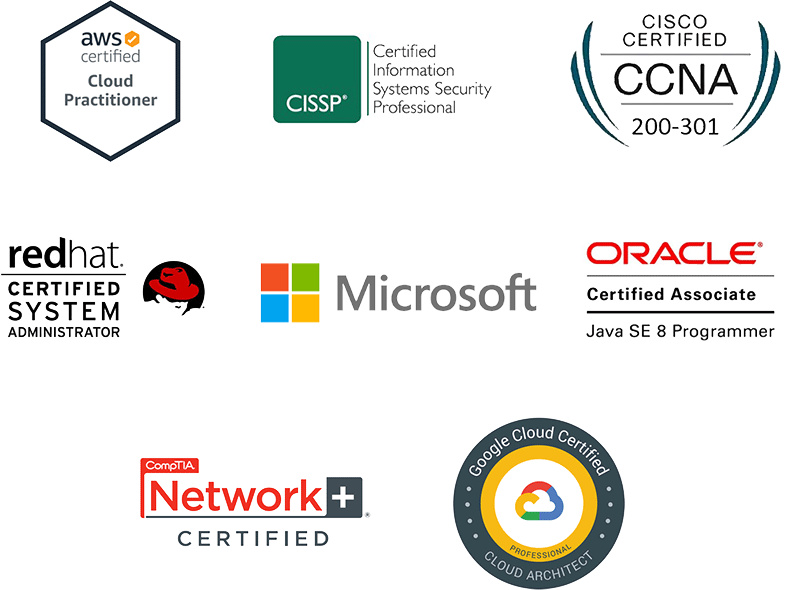
Get on a faster path to certifications
Certifications are hands down the best way to prove your proficiency. Get direct paths to the official prep materials plus practice exams to become an AWS Certified Cloud Practitioner, Certified Information Systems Security Professional (CISSP), Microsoft Azure Administrator, and more.
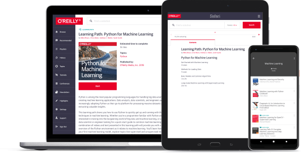
Dive into tons of new content
We’re always adding new books, case studies, videos, early release titles, resource centers, and so much more. And it’s all available through our handy O’Reilly app. So you can learn from experts on your own time, wherever you are.
Join us on O’Reilly online learning for 10 days. Free.
Get insight into what’s happening now. Develop skills to stay ahead of what’s next.
Try it freeNew ways for sponsors to make connections
If you were looking to sponsor an O’Reilly event for lead generation, we’ve put together some great solutions to help drive revenue—no costly expo booth required.
See how